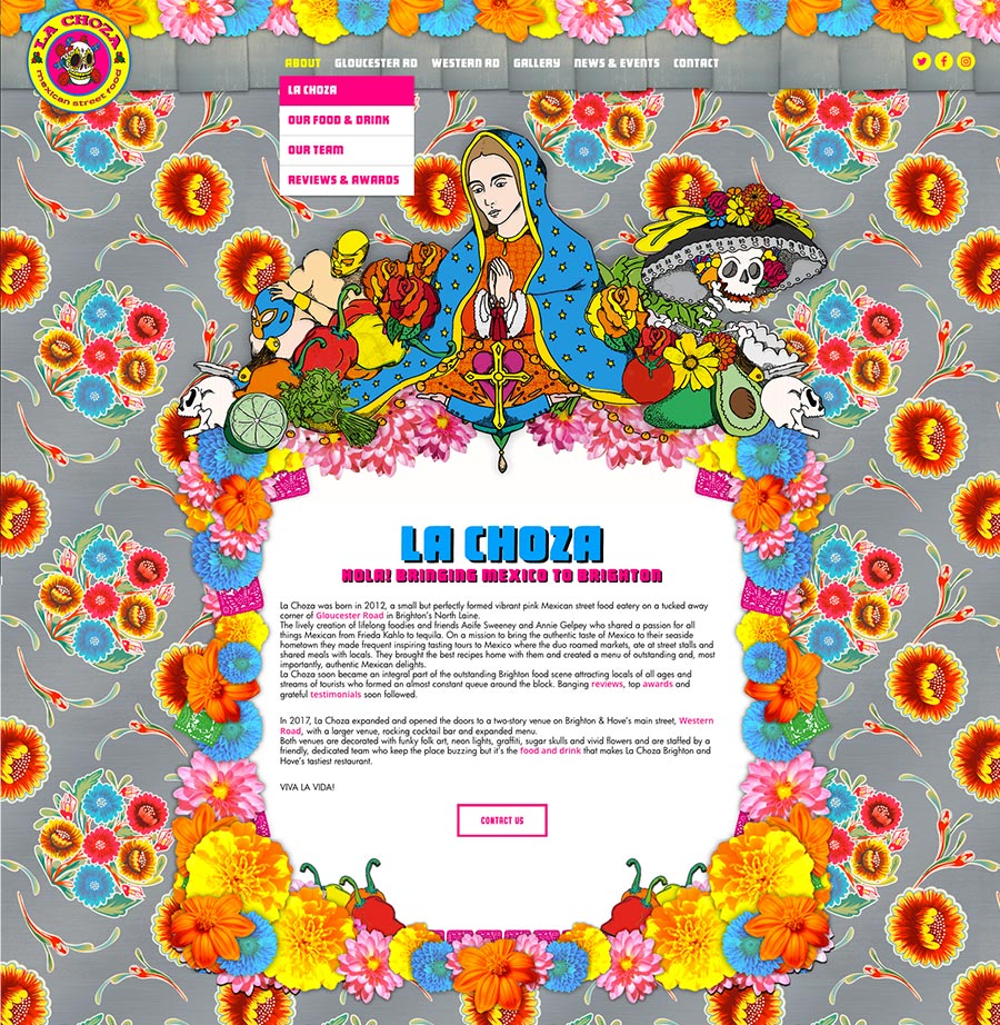
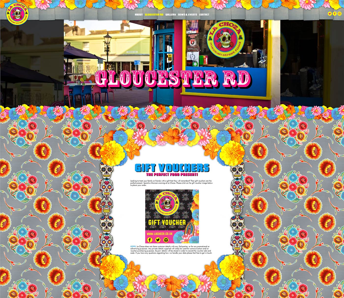
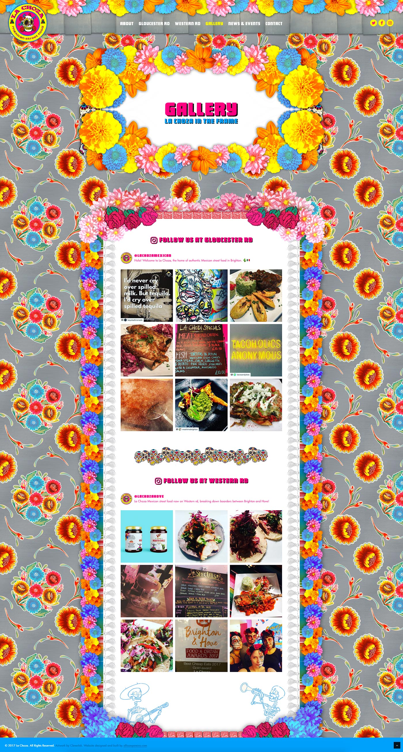
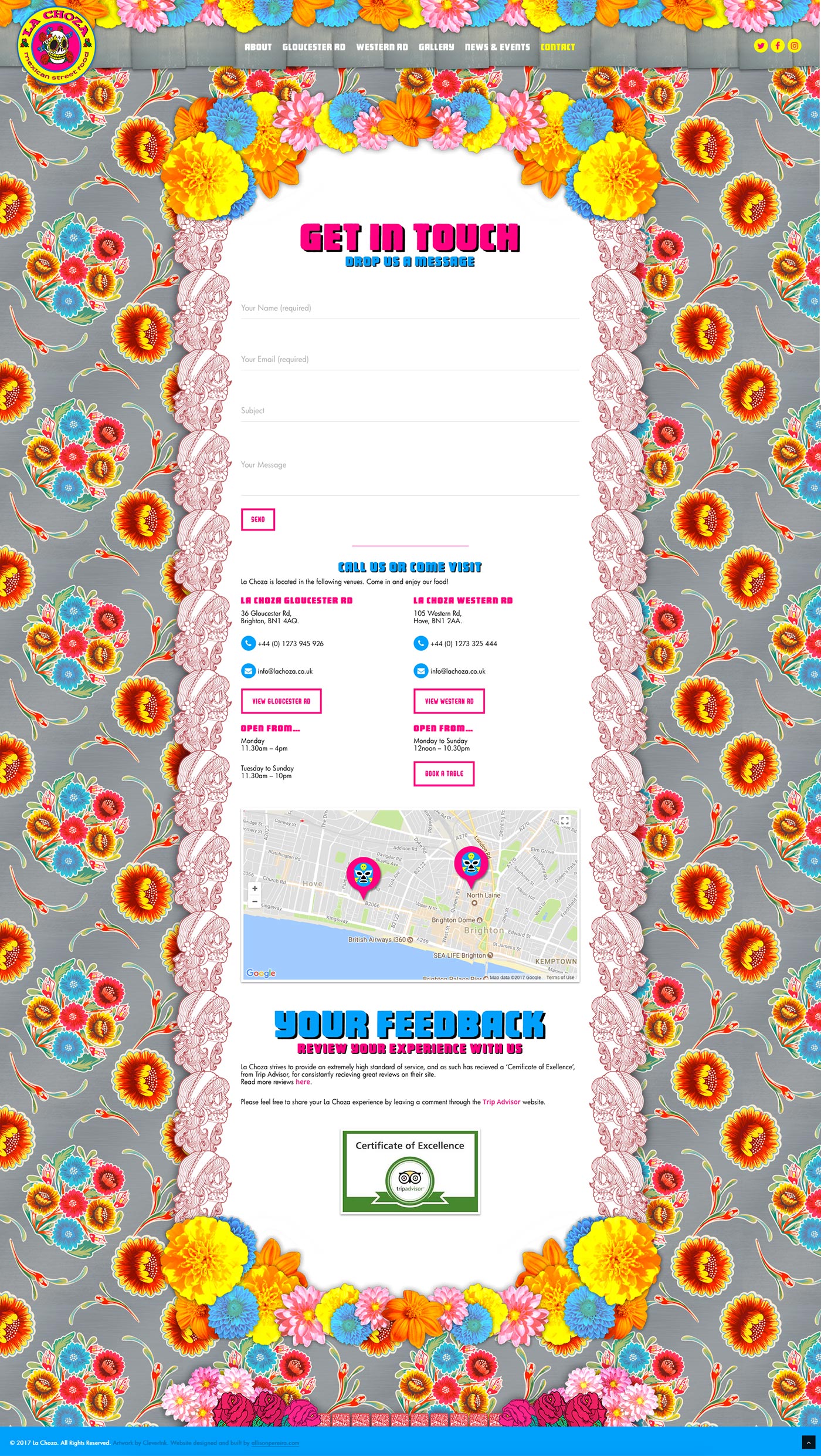
The client requested a total architectural overhaul of their website. The initial one-page layout was to be changed to a multi-page fully responsive site. The strong vibrant company branding is very well established amongst their clientele, and so the client requested to keep this as is. They also requested a site that was very easy for their customers to use with the ability to reach information quickly. Having provided a lot of content information, the client wanted the whole site to be as aesthetically pleasing as possible.
My involvement was to, firstly, show the client the best possible site architecture that would work well with the amount of content the client wanted to portray. After agreeing on this, I used the basic look and feel of the initial art direction to assist me in redesigning each page layout. Existing graphics were reused where possible but, as most were no longer fit for purpose, I had to re-crop all the graphical assets and reconstruct all the ‘flower frames’ to fit the new layout designs. I added some additional art direction, e.g. fonts, and brightened up the brand colours. The main challenge for me was to make sure each ‘flower frame’ was fully device responsive without compromising or breaking the content area. This was controlled with a lot of intricate HTML and CSS coding.
The finished site is very customer friendly, it is still as ‘colour punchy’ as before if not more so, and has received a lot of positive customer feedback.
- UX/UI
- Responsive design
- Website architecture & design
- Website build
- HTML/CSS
- PHP/JavaScript
- WordPress
- Visit website


