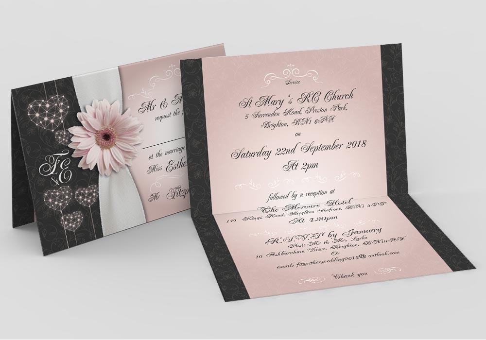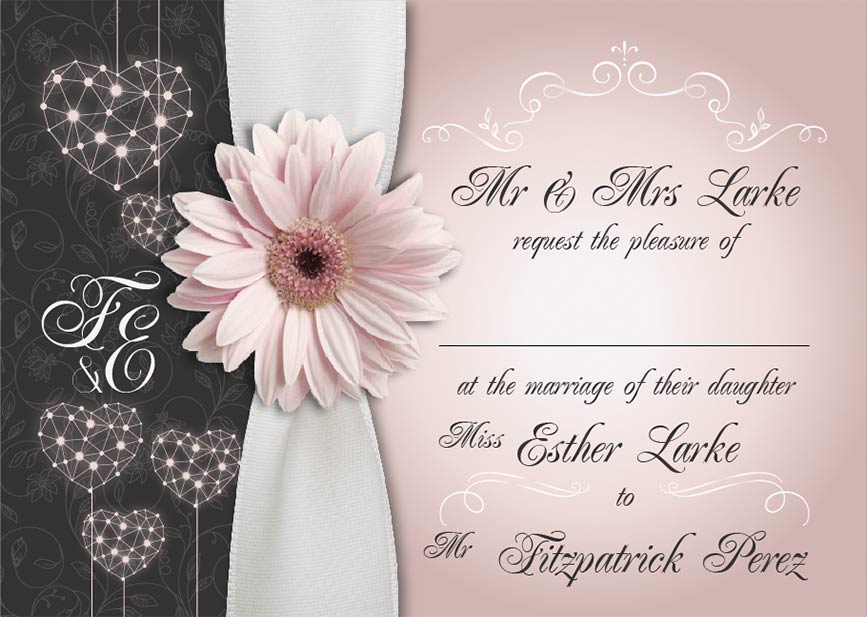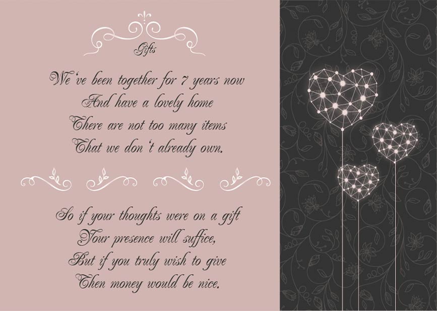
The clients requested a bi-fold design for their wedding cards, in their chosen colours and with the ‘daisy’ flower as the focal point. They wanted a bespoke design that brought together the classic ornate wedding font with a modern design that balanced both a femine and masculine look and feel.
I used the colour of the groom’s grey suit with the colour of the bridesmaid’s dusky pink dresses to pull together the perfect balance of both the bride and groom’s artistic tastes, making the design ‘not too feminine and too masculine’. The clients were delighted with the end product.
- Art direction
- Print work


